Luxury Branding Design for Lucas Khaya Property Investment
TLDC Marketing recently had the privilege of creating a complete brand identity for Lucas Khaya Property Investment, a growing player in South Africa’s property sector. From a striking gold-accented logo to a luxury-inspired business card, this brand identity is designed to convey elegance, professionalism, and trust—the cornerstones of property investment.
1. Logo Design: Structure Meets Sophistication
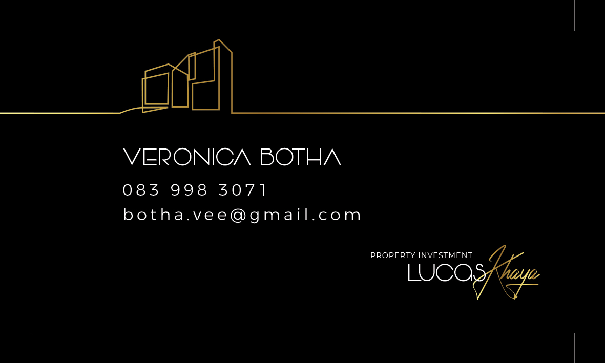
The Lucas Khaya logo features a sleek, line-art roof structure in metallic gold, symbolizing stability and forward growth—core principles of property investment. The blend of two distinct fonts further strengthens its message:
-
“Lucas” uses a clean sans-serif typeface, portraying strength and modernity.
-
“Khaya”, meaning “home,” is handwritten in an elegant script, finished with a luxurious gold gradient to evoke warmth and trust.
This mix of structure and emotion mirrors the dual nature of property investing—strategic planning and emotional value.
2. Business Card Design: Premium First Impressions
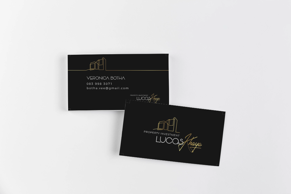
A business card is often the first physical impression of a brand. This design utilizes:
-
A black background to anchor the brand in professionalism and authority.
-
The gold logo to create a sense of exclusivity and high value.
-
Clean white text for optimal legibility and contrast.
The card also offers logo flexibility, adapting seamlessly between gold and white formats across different media without losing its aesthetic strength.
3. Color Palette and Typography: Visual Psychology in Action
The branding uses a black, white, and gold color palette, which signals:
-
Black: Authority, professionalism, luxury
-
Gold: Success, wealth, exclusivity
-
White: Balance, clarity, and space
These elements are supported by typography that combines sharp structure with human warmth—building trust with both investors and property buyers.
4. Why This Branding Strategy Works
This brand identity for Lucas Khaya Property Investment is more than just design—it’s visual storytelling.
-
Scalability: The logo looks great across web, signage, print, and merchandise.
-
Emotional appeal: The handwritten “Khaya” invokes warmth and cultural relevance.
-
Market positioning: The overall design reflects a premium, trusted real estate company focused on delivering long-term value.
Thinking about elevating your own brand? Contact TLDC Marketing to create a powerful visual identity that speaks to your audience.
CONTACT NINYA TODAY
Working in the corporate world since 2000, with more than two decades of experience in brand building, grahic design & website design and development (project management) and online marketing. A successful and commercially driven marketer , with a proven record in providing creative marketing solutions for a wide range of companies.
An expert online digital marketer: analyzing requirements while supporting effective communication to ensure effective project delivery, with a huge passion for the digital world and the influence it has on business today!
We offer services is the Vaal Triangle, Vanderbijlpark, Vereeniging, Three Rivers, Meyerton, Sasolburg, Naledi Vaalpark and outlying area