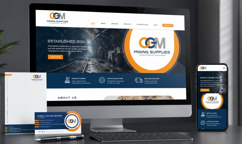
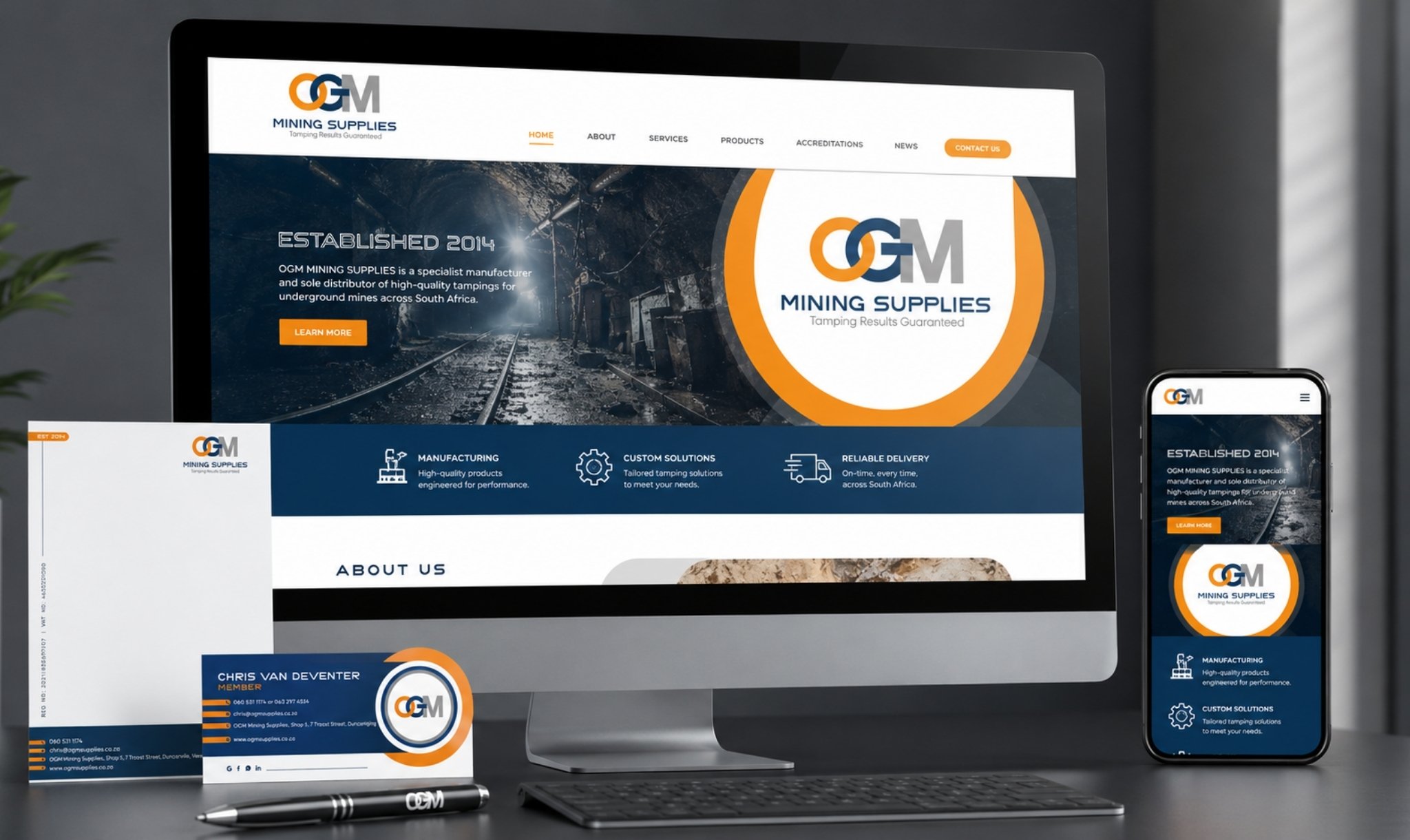
A strong corporate identity for mining suppliers should look professional, technical, trustworthy, and easy to recognise. For OGM Mining Supplies, TLDC Marketing created a clean industrial identity using a strong logo system, blue and orange brand colours, branded stationery, and consistent messaging built around “Tamping Results Guaranteed.”
Who is OGM Mining Supplies?
OGM Mining Supplies is a Vereeniging-based specialist manufacturer and sole distributor of high-quality tampings for underground mines across South Africa. Established in 2014 and led by Chris van Deventer, the company supplies underground mining operations in gold, platinum, coal, and other hard-rock sectors.
The business focuses on two core tamping product types: Tampings and Kgawahla. OGM also offers manufacturing, custom sizing according to client shot hole dimensions, and dependable delivery. Their strength lies in local manufacturing, practical mining experience, fast turnaround, and the ability to support mines with product consistency.
For TLDC Marketing, this made the brand brief clear. OGM did not need a decorative identity. They needed a corporate identity that could stand next to established industrial suppliers and still feel specific to underground mining.
The Design Brief
What OGM Needed
The goal was to revamp OGM Mining Supplies’ existing brand into a strong corporate identity and prepare the business for a more professional online presence. The identity needed to feel modern, clean cut, industrial, and reliable.
The design direction had to reflect the product and the environment it serves. Tampings are used in underground mining and blasting applications, so the brand needed visual weight, precision, and technical confidence. At the same time, it needed to remain clean enough for professional use across formal documents, email communication, business cards, and digital platforms.
The selected colour palette included blue, orange, grey, white, and black. Blue became the primary anchor because it communicates trust, professionalism, and corporate stability. Orange added industrial energy and helped the identity stand out in a sector where many competitors lean heavily on blue, grey, or monochrome palettes.
We deliberately avoided yellow, purple, and pink. These colours did not support the required tone. Yellow could have pushed the brand too close to generic construction styling, while purple and pink would not have aligned with the mining-sector visual language OGM needed.
Typography also played an important role. The type needed to feel corporate, clean cut, readable, and industrial. Every brand element had to support clarity because mining procurement, operational, and technical audiences need information they can process quickly.
The tagline, “Tamping Results Guaranteed,” became a key part of the identity system. It gives the brand a confident promise and reinforces OGM’s specialist positioning.
The Strategy — Designing for the Mining Sector
Mining brands must do more than look strong. They must signal competence, reliability, safety awareness, and operational understanding. A weak or generic identity can make a supplier look inexperienced, even when the product is strong.
Our team benchmarked the visual landscape around mining and industrial suppliers, including Minova, Plastic Innovations, Sibanja, and BME. The goal was not to copy these brands. Instead, we studied how established competitors use structure, colour, typography, and technical cues to build trust.
From there, we positioned OGM as professional and industry-aligned, but still distinctive. The identity needed to feel established enough for mine procurement teams, while also fresh enough to support future digital marketing and SEO visibility.
The strongest design insight came from the OGM acronym itself. We built the CI around a bold typographic treatment of the letters O, G, and M. The overlapping elements create a visual sense of strength, precision, and connection. More importantly, the overlap subtly echoes the consolidating action of tamping itself. It gives the logo a concept rooted in the product, not just an attractive graphic treatment.
The blue and orange combination also served a strategic purpose. In a 2025/2026 search environment, industrial brands compete in AI Overviews, image results, Google Business listings, website thumbnails, and social feeds. A blue-only mining identity can disappear among similar competitors. The orange accent gives OGM better visual recognition in small digital spaces, especially when the logo appears as a thumbnail, footer mark, email signature, or social media profile image.
The “EST 2014” badge was added as a heritage marker. It reinforces nine-plus years of industry presence and helps the identity feel established without overcomplicating the design.
The Corporate Identity Elements We Delivered
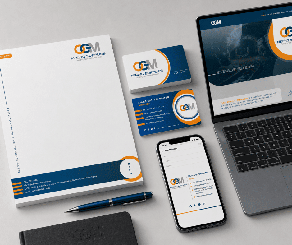
A corporate identity package must work across many touchpoints. It needs to look consistent whether someone sees the brand on a business card, formal letterhead, email signature, PDF quotation, or website banner.
For OGM Mining Supplies, we created a practical identity system that supports both print and digital use.

Logo and tagline system
The primary logo uses the OGM acronym as the central visual element. The letterforms are strong, structured, and clean. This helps the logo read clearly across different sizes and applications.
The tagline “Tamping Results Guaranteed” was integrated into the logo system to strengthen the brand promise. This line is not just a slogan. It tells mining clients exactly what OGM wants to be known for: dependable tamping performance.
We also created logo variations to allow flexibility across different backgrounds and formats. This is important because industrial brands often need to use their identity on presentations, forms, signage, vehicle applications, social media, and web layouts.
Business card front and back
The business card design needed to feel professional, clear, and memorable. We created a front and back layout that uses the OGM logo, colour palette, contact information, and industrial styling in a balanced way.
The front supports immediate recognition. The back gives the card practical value by presenting contact details cleanly. This matters because business cards are still useful in mining, supply, and procurement environments where relationships often begin on-site or through direct meetings.
The design avoids clutter. Instead, it uses space, contrast, and strong brand colours to make the card feel corporate and easy to read.
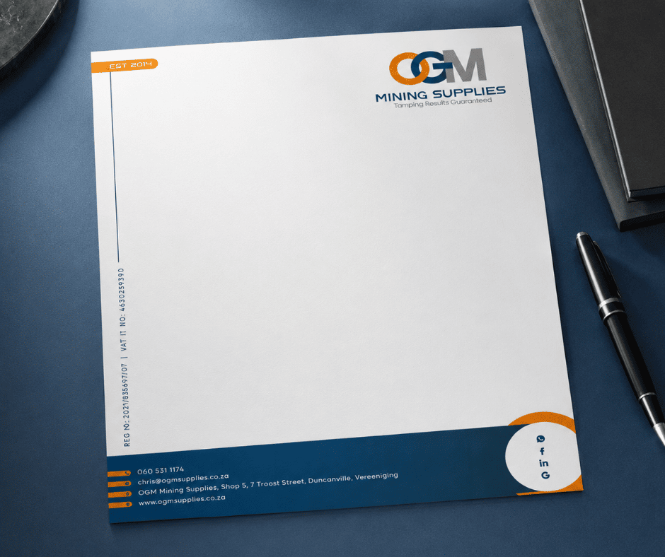
Letterhead
The letterhead was designed for formal communication, quotations, proposals, documentation, and supplier correspondence. It needed to look professional without distracting from the content.
We applied the OGM colour palette and logo system in a controlled way. The result is a branded document template that supports credibility in day-to-day business use.
For industrial suppliers, letterheads still matter. Mines and corporate buyers often receive quotations, compliance documents, delivery notices, and technical communication by email or PDF. A branded letterhead helps every document feel more polished and trustworthy.
Email signature
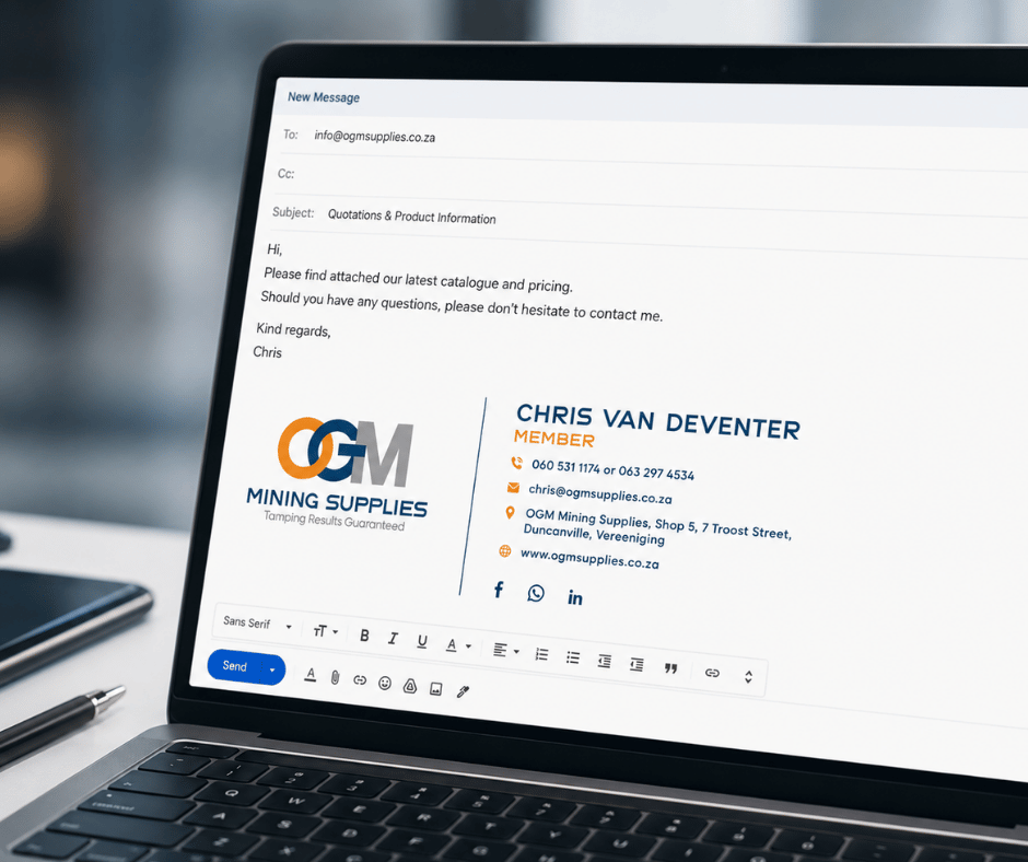
The email signature extends the identity into daily communication. This is one of the most overlooked parts of corporate identity, yet it is often the brand element clients see most frequently.
For OGM, the email signature includes the logo, contact details, and social media icons for Facebook, LinkedIn, Google Business, and WhatsApp. This makes it easier for clients to move from email to the right action, whether they want to call, visit the website, check social proof, or start a WhatsApp conversation.
A strong email signature also supports brand consistency across directors, sales teams, admin staff, and operational communication.
Design Brief vs Final Delivery
| Design Area | Brief Requirement | Final Delivery |
|---|---|---|
| Look & Feel | Modern, clean cut, industrial | A structured mining-sector identity with strong typography and technical confidence |
| Typography | Corporate, readable, industrial | Bold OGM acronym treatment with clean supporting type for professional use |
| Colour Palette | Blue and orange, with grey, white, and black | Blue used as the trust anchor; orange added industrial energy and recognition |
| Tagline Integration | “Tamping Results Guaranteed” included throughout | Tagline built into the logo system and extended across CI applications |
| Industry Reference | Tamping, blasting, underground mining | Overlapping forms subtly reference precision, strength, and tamping consolidation |
| Competitor Differentiation | Stand apart from established mining suppliers | Professional enough for the sector, but more distinctive through orange accents and custom letterform treatment |
Why This Identity Works for AI Overview and Modern Search Visibility
Corporate identity is no longer only about printed stationery. In 2026, a brand also has to work inside search results, AI Overviews, Google Business profiles, website previews, mobile screens, and social media feeds.
That is why we designed the OGM identity to be clear, recognisable, and consistent across multiple formats. A strong identity helps users remember the business after seeing it online. It also gives Google and AI-driven search systems a more consistent brand footprint to understand.
The same AI-first thinking that powers OGM’s blog programme also shaped how we structured their digital identity for online discoverability. TLDC Marketing applies this approach across brand design, web design, and content strategy, including our work on AI SEO blogs that help businesses rank in Google and AI Overviews.
For mining and industrial suppliers, this matters. A potential client may first see the brand through a search result, then a blog article, then a Google Business profile, then an email signature. If every touchpoint looks connected, the business feels more established.
The OGM CI system gives the brand this consistency. It supports trust before a sales conversation even begins.
What’s Next for OGM
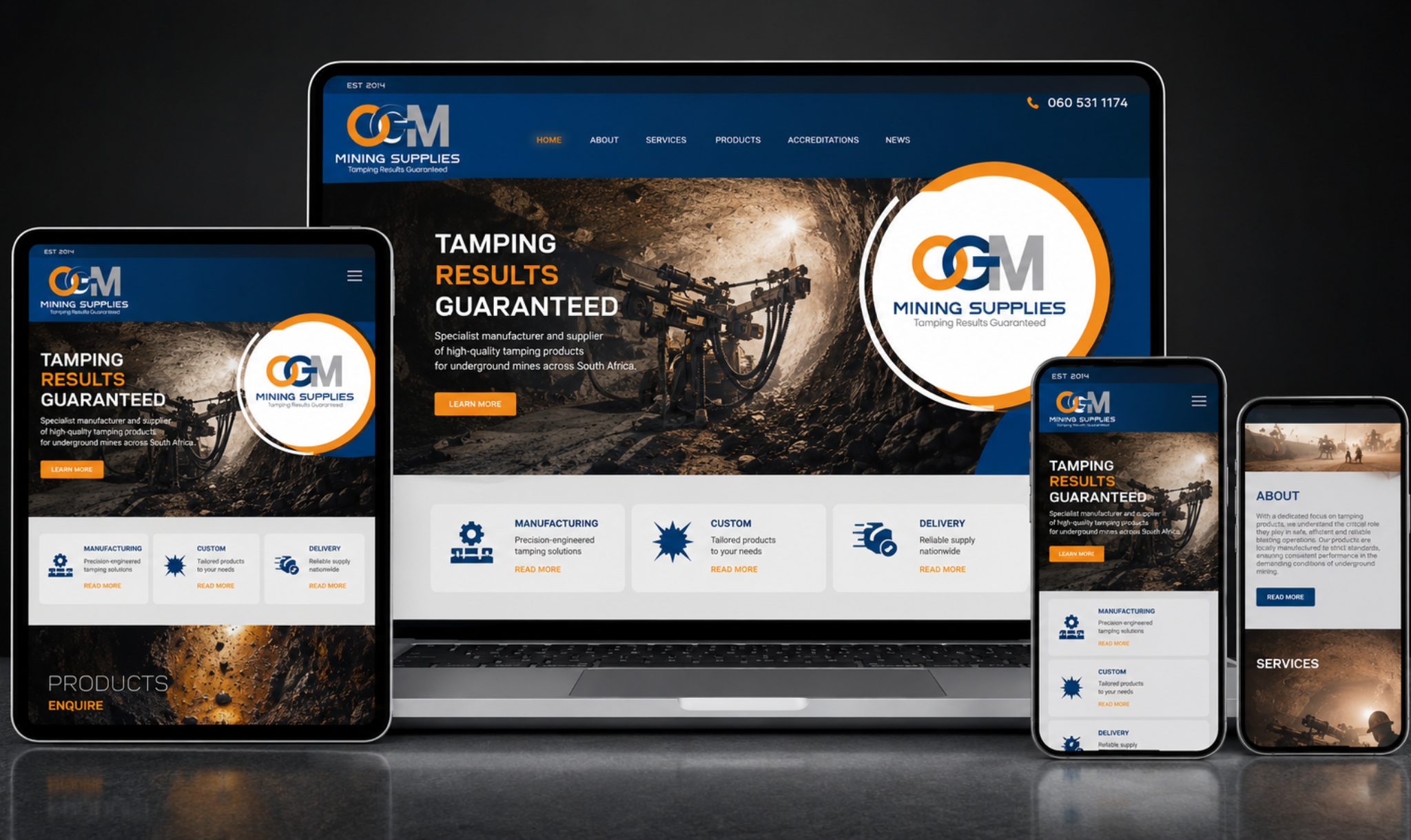
The corporate identity became the foundation for the next project phase: a custom WordPress website for OGM Mining Supplies. Read the website here
Need a Corporate Identity That Works This Hard?
A professional corporate identity should do more than look attractive. It should help your business communicate clearly, compete confidently, and build trust across print, digital, search, and sales environments.
At TLDC Marketing, our team works with SMEs and corporate clients across the Vaal Triangle and South Africa to create strategic brand identities, websites, and AI-driven SEO content. You can view more of our completed work on the TLDC Portfolio page
If your business needs a logo, brand refresh, stationery design, or full corporate identity system, explore our Graphic & Web Design services
To start a conversation about your next brand project, contact TLDC Marketing
FAQ SECTION
What does a corporate identity package include?
A corporate identity package usually includes a logo, colour palette, typography direction, business card, letterhead, email signature, and basic brand application rules. Larger packages may also include social media templates, company profiles, signage concepts, and website design direction.
How long does a corporate identity project take?
The timeline depends on the size of the project, the number of brand elements required, and how quickly feedback is provided. A simple logo and stationery package may take a few weeks, while a full corporate identity and website rollout can take longer.
Why does colour psychology matter in industrial branding?
Colour psychology helps a brand communicate the right message before anyone reads a word. In industrial branding, colours like blue, grey, black, and orange can support trust, strength, safety, energy, and technical confidence.
What makes a logo work in the mining sector?
A mining-sector logo should feel strong, readable, professional, and practical across many applications. It should work on documents, signage, clothing, vehicles, websites, email signatures, and small digital thumbnails.
How much does corporate identity design cost in South Africa?
Corporate identity design costs in South Africa vary widely based on the designer, strategy required, and number of deliverables. Basic logo packages may start in the lower thousands, while full corporate identity systems with stationery, brand guidelines, and digital rollout can cost significantly more.